BRAYL Atmosphere Spray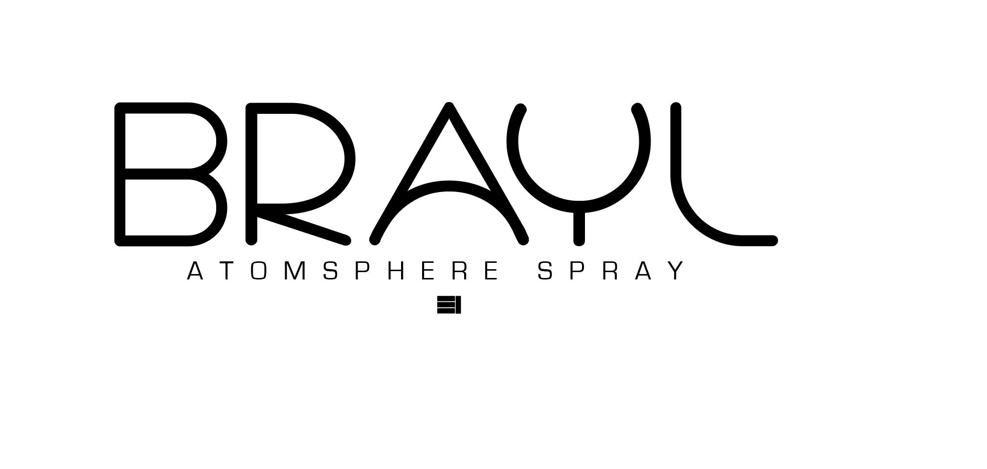
We created BRAYL’s identity concept from initial direction through the wordmark, signature, and packaging, translating a feeling of presence into a complete visual language.
- OUR ROLE
- Visual identity · Packaging · Brand atmosphere
- APPROACH
- Open forms, natural materials and a restrained visual language.
A moment.
A place to be.
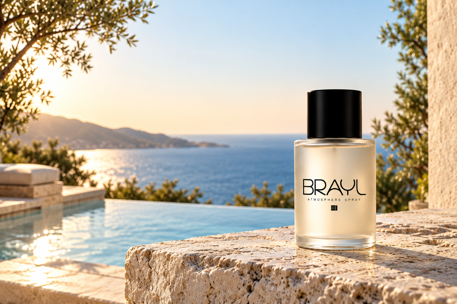
BRAYL begins with a simple thought: the moment when you realize there is nowhere else you need to be but now. The identity makes room for that feeling through open space, warm light and a calm relationship between the product and its surroundings.
Quiet in color.
Clear in character.
Grounded in place.
Jet gives the mark its definition. Mist keeps the system open. Stone and earth connect the identity to the materials and landscape around it.
Type with presence.
Cyclo gives BRAYL its distinctive open forms. Eurostile brings structure and clarity to the supporting language, with generous spacing that keeps the identity calm and considered.
One name.
A lasting signature.
The wordmark leads. The small geometric signature gives the identity a second point of recognition, carrying the same restraint into the bottle, carton and finer details.
A tactile expression.
A considered finish.
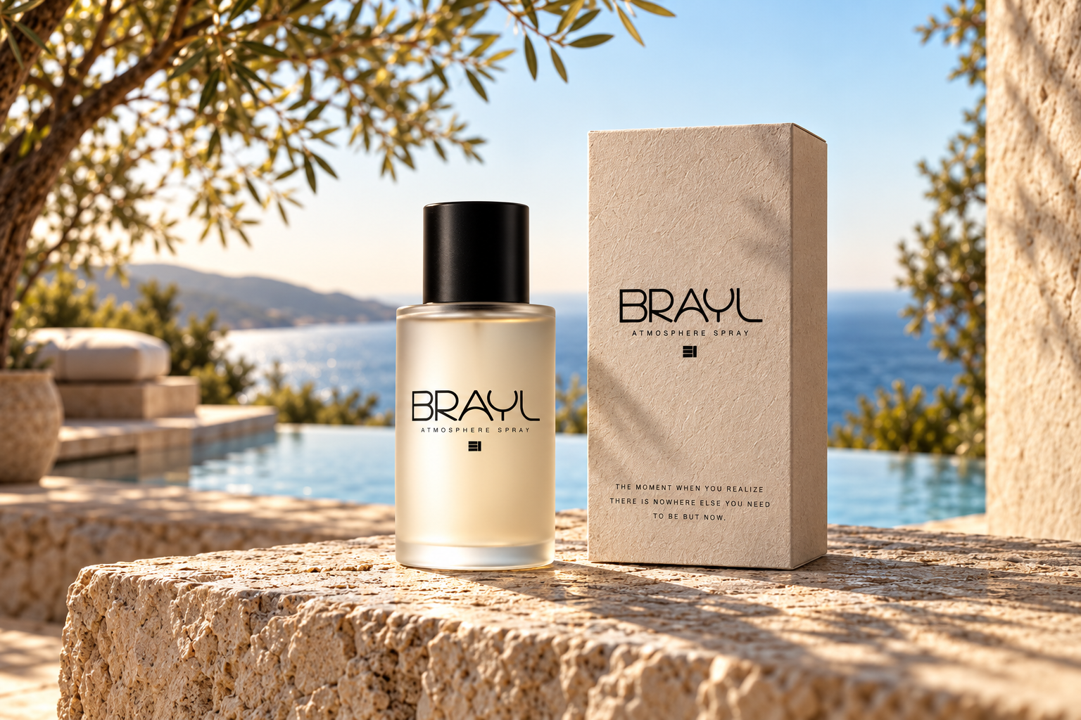
Frosted glass, a black cap and textured paper translate the identity into objects. The clear hierarchy keeps the name recognizable while the materials bring warmth and depth.
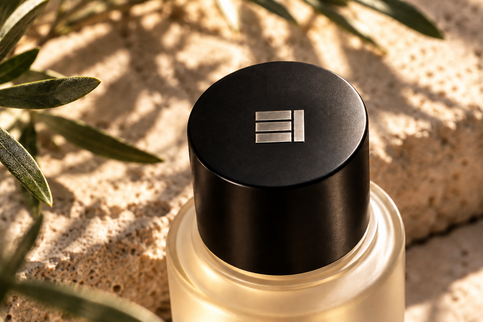
A smaller mark.
The same presence.
On the cap, the signature becomes a quiet finishing detail. It connects the smallest surface back to the full identity without competing with the wordmark.
At home
in the atmosphere.
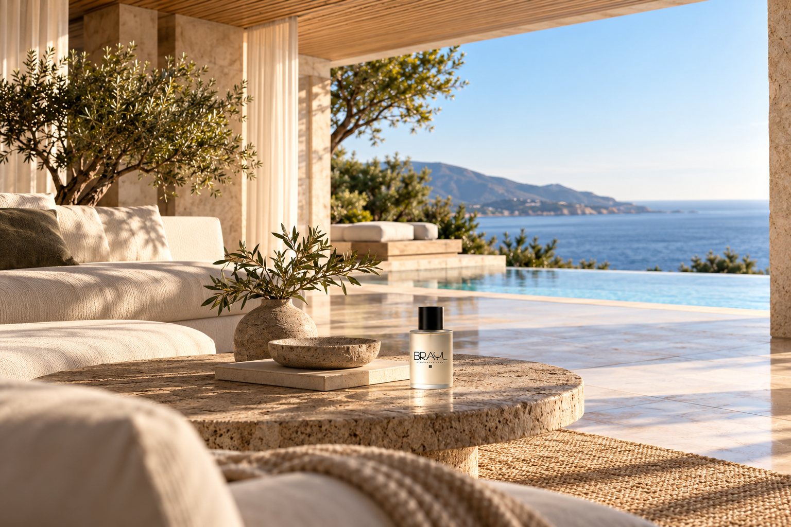
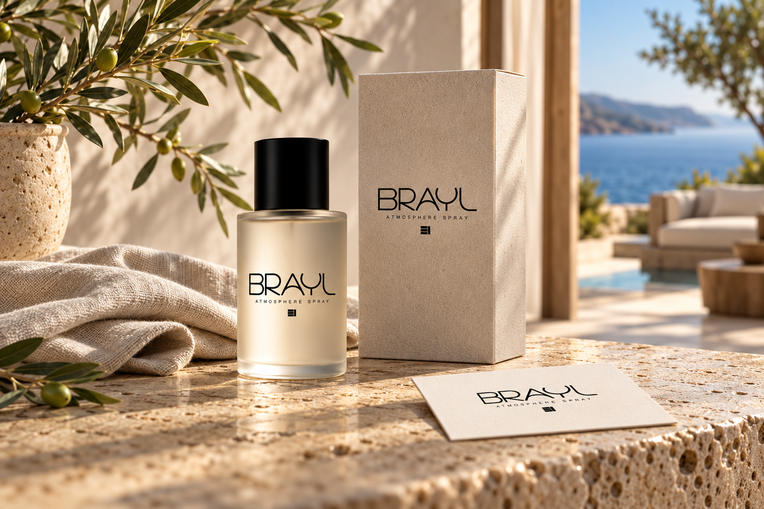
The bottle, carton and printed touchpoint share one visual language. Natural stone, linen and olive branches place the identity within an environment that feels connected to its original idea.
There is nowhere else
you need to be but now.
A name, a signature and a material expression, brought together around a moment of presence.
EXPLORE MORE PROJECTS EXPLORE OUR SERVICES